Dashboard Overview
Your Central View
The GitVelocity dashboard is the first thing you see after signing in. It provides an organization-level summary of engineering velocity, giving managers and team leads a single place to understand what their teams are shipping and how complexity trends over time.
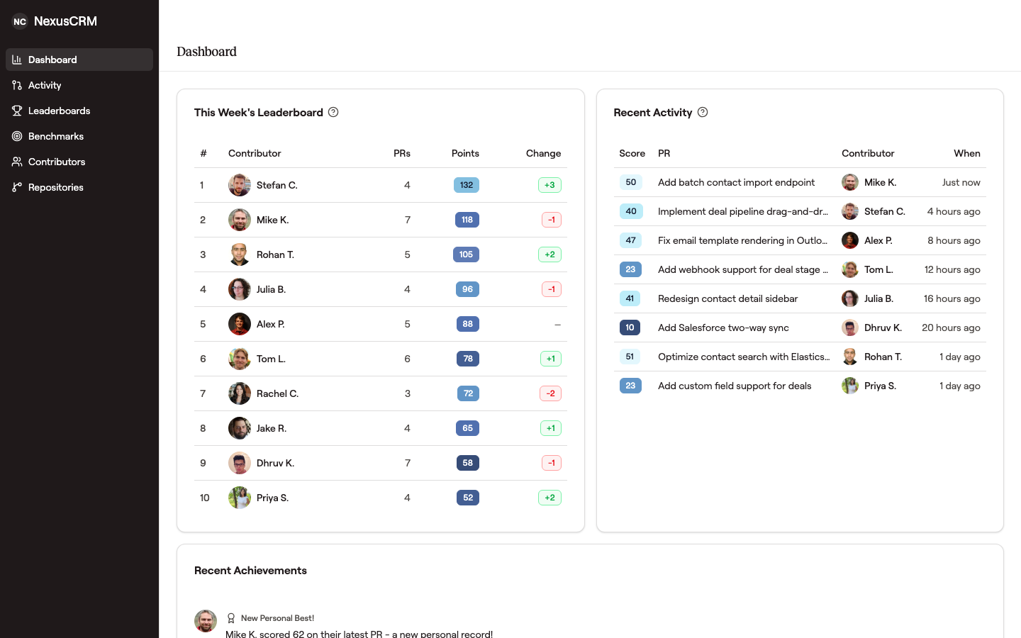 The dashboard surfaces the leaderboard, recent activity, and recognition on one screen so leads don't have to context-switch to see what their team is shipping.
Time Range Filters
Use the time range selector to focus the dashboard on the period that matters most. Built-in options include 7-day, 30-day, and 90-day windows, along with a custom date picker for ad-hoc analysis. All charts, summaries, and breakdowns update instantly when you change the range.
Repository Breakdown
The repository breakdown shows velocity metrics for each connected repository side by side. Compare average PR scores, total velocity, and PR volume across repositories to identify where the most complex work is happening and how output is distributed.
Team and Contributor Summary
Summary cards highlight top contributors, total PRs scored, and aggregate velocity for the selected time range. At a glance, you can see who is active, which teams are shipping, and how individual output contributes to the whole.
Filtering by Language
A language selector sits beside the team performance chart. It narrows the trend to changes where one language made up the biggest part of the diff, so you can follow a single stack over time instead of the blended average of everything your team ships.
Further down, the Score by Language chart compares your busiest languages against each other, either as a monthly total or per change. Score tracks change size as much as difficulty, so config languages sit low because config diffs are small. Languages covers how the label is picked and how to read that chart.
Score Distribution
A distribution chart groups scored PRs into buckets, showing how your team's work falls across the 0--100 scale. This makes it easy to spot patterns -- for example, whether the team is mostly shipping small incremental changes or tackling high-complexity features.
Trend Lines
Trend lines track velocity over time so you can see whether output is increasing, plateauing, or shifting in character. Use trends to correlate velocity changes with team events like sprint boundaries, new hires, or priority shifts.
Reading a chart with a large team
Once a chart carries more than about a dozen people, color stops doing its job -- there are only so many line colors the eye can tell apart at a glance, and past that point every line looks like every other line.
So on a larger team the chart offers to highlight the contributors who produced half the output across the range it draws, and fade the rest. It does not do this on its own -- every line starts at full strength, because deciding who matters before you have asked is not the chart's job.
The sentence above the chart says how many people that is: "5 key contributors produced half of all output over the last 12 weeks." The count in that sentence is the control -- select it and the charts show only those people in color. Select it again to bring everyone back.
When it is on, nobody is removed: every contributor is still drawn, still in the list beside the chart, and still counted in every total. The faded lines are the same data, shown quietly so the shape of the chart is readable.
The range matters. Highlighting is judged across the whole span on screen, not the newest bar alone -- so somebody who carried the team for two months and shipped nothing this week is still highlighted, and you can see where they stopped. Judging it on the newest bar would have faded their entire line, which is the one case you most want to notice.
Each chart decides this for its own range, which is why the weekly and quarterly views can highlight different people. A quarter can be concentrated in a few contributors while the last twelve weeks were spread evenly across the team -- that difference is worth seeing, not smoothing over.
Selecting specific contributors from the list takes over instead: your selection wins, and the charts highlight exactly who you picked.
When somebody stops
A small triangle on a line marks the last period before that person's output fell off and stayed down. It appears only where the fall is large enough to be worth a reader's attention and where that person was producing enough to have been carrying real weight -- on most charts, no line carries one.
It is deliberately quiet about why. Someone who has stopped shipping, someone who left, and someone on leave all draw the same mark, and the chart has no way to tell them apart. It marks where to look, not what to conclude.
Frequently Asked Questions
How often does the dashboard update?
Scores appear within a few minutes of a PR merging. The dashboard reflects real-time data -- there is no overnight batch process. As soon as the AI finishes scoring a PR (approximately 30 seconds), it shows up.
Can I filter by team or repository?
Yes. The dashboard supports filtering by repository, time range, contributor, and programming language. You can compare velocity across different repositories or zoom in on a specific team's output.